Frutiger Metro: The Controversial ‘Good Design’ Myth
Frutiger Metro is a typeface we see constantly, often lauded for its legibility. But is this ubiquitous sans-serif truly the pinnacle of design, or just a product of relentless marketing and inertia? Let’s get real. For decades, Frutiger Metro has been the go-to font for everything from airport signage to corporate logos, and it’s almost always presented as an unimpeachable example of clarity and accessibility. But I’m here to tell you that much of this praise is, frankly, undeserved. It’s a typeface that’s become so ingrained in our visual landscape that we’ve stopped questioning its supposed brilliance.
The reality is, Frutiger Metro (and its progenitor, Frutiger) has significant flaws that are often overlooked. We’re so used to seeing it that its quirks have become invisible, its weaknesses mistaken for strengths. This isn’t about trashing a typeface. it’s about taking a critical look at why something becomes dominant and whether that dominance is justified by its actual design merits. Honestly, I’ve spent years sifting through typefaces for clients, and every time I revisit Frutiger Metro, I find myself shaking my head, wondering why we settled.
what’s Frutiger Metro, Really?
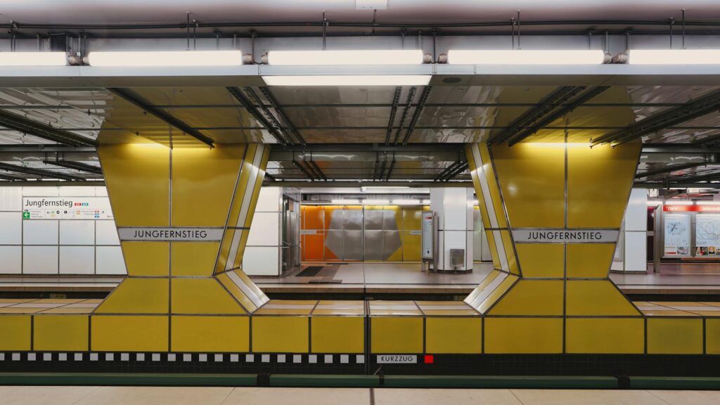
Frutiger Metro is basically a condensed version of the original Frutiger typeface, designed by the legendary Adrian Frutiger in 1999. The goal? To create a font optimized for the specific demands of wayfinding and signage in the Paris Métro system. This meant enhancing legibility at a distance, in various lighting conditions, and at small sizes on electronic displays. It’s a humanist sans-serif, meaning it draws inspiration from the forms of handwriting — which is often cited as a reason for its perceived warmth and readability. The ‘Metro’ version aimed to be even more efficient with space, a Key factor in dense signage environments.
[IMAGE alt=”Comparison of Frutiger and Frutiger Metro letterforms” caption=”Subtle differences between Frutiger and Frutiger Metro, focusing on space efficiency.”]
The original Frutiger typeface, released in 1980, was itself a redesign of Roissy, commissioned for Charles de Gaulle Airport. Both were born from a need for clear communication in high-traffic, high-stress environments. So, the pedigree is undeniable. Adrian Frutiger is a titan of 20th-century typography. But even titans can produce work that, while functional, isn’t necessarily groundbreaking or perfect. And the Metro version, designed to be even more ‘efficient,’ often feels cramped and less graceful than the original.
Why the Hype? The Power of Inertia and Marketing
So why is Frutiger Metro held in such high regard? Part of it’s sheer inertia. Once a typeface is embedded in major systems—like a national railway or a global airport—it gains a life of its own. It becomes difficult and expensive to change. Think about how many times you’ve seen the same logo or the same font on signs and just accepted it. Secondly, there’s the name: Adrian Frutiger. His reputation precedes him, and anything he designed is automatically assumed to be gold standard. This creates a halo effect where the typeface is praised because of its creator, not necessarily its intrinsic qualities.
Also, the design industry often suffers from a herd mentality. When a typeface is widely adopted by influential design agencies and corporations, others follow suit. It becomes the ‘safe’ choice, the ‘professional’ choice. Here’s especially true for corporate branding and public infrastructure — where designers might prioritize avoiding criticism over seeking genuine innovation or aesthetic superiority. It’s easier to use Frutiger Metro and say, ‘Well, it’s highly legible,’ than to defend a more adventurous choice that might be perceived as risky.
“Frutiger Metro is often praised for its legibility, but I’ve found its condensed nature can sometimes hinder clear reading at speed, especially with complex information hierarchies. The letterforms, while distinct, can feel a bit too uniform.”
— A Senior UX Designer’s Anonymous Feedback
The Actual Problems with Frutiger Metro
Let’s get down to brass tacks. What are the actual issues? For starters, the ‘Metro’ version is condensed. While this saves space, it often leads to awkward letterforms. Look at the lowercase ‘a’ and ‘e’ — they can appear squashed, losing some of the humanist charm of the original. The ‘g’ can be especially problematic, sometimes looking more like a ‘q’ at a glance. And while the strokes are designed to be even, in the condensed form, they can sometimes feel a bit too uniform, lacking the subtle variation that makes typefaces like Univers or Helvetica (despite their own flaws) feel more dynamic.
Another point of contention is its supposed ‘warmth.’ It’s a humanist sans-serif, yes, but it often feels cold and utilitarian. This isn’t necessarily a bad thing for signage, but it’s often marketed as friendly and approachable — which I just don’t see. It feels functional, almost sterile. It does its job, but it doesn’t exactly make you feel anything positive beyond relief that you can read the directions.
And accessibility? It’s legible, sure. But is it the most accessible? I’d argue no. Typefaces designed In particular with extreme accessibility in mind, like Atkinson Hyperlegible or the newer Lexend, often do a better job of catering to a wider range of visual needs. Frutiger Metro is good, but ‘good enough’ isn’t always the same as ‘best in class,’ especially when we’re talking about public services where clarity is really important.
Specific Letterform Quirks
Let’s dive a bit deeper into some specific letterforms that irk me. The uppercase ‘R’ has a rather closed-off tail. In certain contexts, especially at smaller sizes, this can make it visually similar to the ‘P’. The lowercase ‘t’ and ‘f’ can also be tricky. their crossbars are quite thin and can disappear easily. And the punctuation? The periods and commas are tiny little specks that can be hard to spot on busy backgrounds.
Honestly, the real issue is that we’ve accepted ‘good enough’ as ‘great.’ If a new typeface came out today with these same quirks, I doubt it would achieve the same level of acclaim. It would be dissected, criticized, and likely dismissed as merely ‘functional.’ But because it carries the Frutiger name and has been around forever, it gets a pass.
[IMAGE alt=”Close-up of Frutiger Metro punctuation marks” caption=”The small punctuation marks in Frutiger Metro can be hard to see at a distance.”]
🎬 Related Video
📹 frutiger metro — Watch on YouTube
Frutiger Metro vs. Other Typefaces: A Reality Check
How does Frutiger Metro stack up against its peers? Let’s consider a few. The original Frutiger? I often prefer it. It has more breathing room, more personality. Univers? A geometric sans that’s incredibly clean and consistent, sometimes seen as colder but clear. Helvetica? The king of neutrality, though its legibility has been debated for years. For signage, I’ve often found myself leaning towards something like Open Sans or Lato – they offer good readability, are free for commercial use, and feel a bit more contemporary without sacrificing clarity.
For pure wayfinding, you could argue for typefaces like Transport, In particular designed for road signs in the UK. It prioritizes high visibility and distinct letterforms above all else. Or consider FF Dax — which offers a similar geometric feel but with a bit more character. Frutiger Metro sits in a crowded middle ground – it’s not as geometrically pure as Univers, not as neutral as Helvetica, and not as overtly humanist as, say, tons of Pro. It’s functional, yes, but often feels like a compromise.
- Widely available and familiar.
- Generally legible for most common signage needs.
- Designed with specific wayfinding requirements in mind.
- Carries the legacy of Adrian Frutiger.
- Condensed letterforms can feel cramped and awkward.
- Can appear cold and utilitarian, lacking warmth.
- Specific letterforms (g, a, R) can be problematic.
- Other typefaces might offer superior legibility or distinctiveness.
- Over-reliance and inertia make it a ‘safe’ but uninspired choice.
Practical Tips: When to Use Frutiger Metro (and When to Avoid It)
Look, I’m not saying you should never use Frutiger Metro. It’s a tool, and like any tool, it has its place. If you’re working on a project that requires a high degree of similarity to existing public transport signage for consistency, or if you’re rebranding a system that already heavily uses it and budget is a massive constraint, then fine. Use it. But be aware of its limitations.
When to consider Frutiger Metro:
- Public Transport Signage: If you need to match existing systems or are designing new ones where extreme legibility at distance is key and budget is tight.
- Corporate Identity (with caution): If your brand needs to convey a sense of established, no-nonsense professionalism. But be prepared to work hard to make it feel unique.
- Wayfinding Systems: Its original purpose. It can work, but don’t assume it’s the automatic best choice.
When to actively AVOID Frutiger Metro:
- Branding that needs personality: It’s too utilitarian for brands aiming for warmth, approachability, or uniqueness.
- Long-form text: While legible, its condensed nature isn’t ideal for extended reading on screens or in print. You’ll find far better options.
- Anything requiring genuine aesthetic innovation: If you want your design to stand out and be memorable for its visual appeal, look elsewhere.
- Projects prioritizing latest accessibility: Explore fonts In particular engineered for a broader range of visual needs.
My personal advice? Try alternatives first. Explore fonts like or. Even the original Frutiger often feels more appropriate. Don’t just default to Metro because it’s there. You might be surprised what you find.
Frutiger Metro: A Case Study in Design Stagnation?
The story of Frutiger Metro feels like a cautionary tale about how design can become stagnant. We get comfortable. We rely on past successes. And we stop pushing the boundaries. The typeface itself isn’t bad. it’s just that it’s been elevated to a status it doesn’t entirely deserve, overshadowing more innovative or perhaps even more suitable alternatives. It’s a testament to good marketing and the power of established systems, not necessarily to superior design principles in every application.
Think about it: if a designer presented Frutiger Metro today for a major airport rebrand with no prior context, would it be chosen over dozens of other excellent sans-serifs available? I suspect it might be overlooked, dismissed as ‘too common’ or ‘a bit dated.’ But because it’s already there, it persists. And we, the public, are left with a font that’s functional but rarely inspiring. It’s time we looked critically at the design choices we accept as gospel.
For a deeper dive into typography’s impact, check out articles on the Swiss Style movement — which heavily influenced the kind of functional design principles often associated with Frutiger Metro. Understanding that context helps explain its rise, even if we now question its ultimate merit.
Frequently Asked Questions
Is Frutiger Metro the most legible typeface?
No, Frutiger Metro is highly legible, but not definitively the most legible. Typefaces In particular engineered for extreme accessibility, like Atkinson Hyperlegible, or those designed for specific contexts, like road signage fonts, may offer superior legibility in certain situations. Its legibility is good, but often overstated.
Why is Frutiger Metro so popular for signage?
Its popularity stems from its origins with Adrian Frutiger, its intended use for wayfinding systems like airports and metros, and the resulting inertia. Once adopted by major institutions, it became a safe, familiar choice that’s difficult and expensive to replace.
What are the main differences between Frutiger and Frutiger Metro?
Frutiger Metro is a condensed version of the original Frutiger typeface. It was designed to save space, making its letterforms tighter and narrower. This condensation can sometimes impact its overall aesthetic and readability compared to the more open and spacious original Frutiger.
Can Frutiger Metro be used for body text?
While technically possible, Frutiger Metro is generally not recommended for extended body text. Its condensed nature makes it less comfortable for reading long passages, and many other sans-serif typefaces offer better readability and a more pleasant reading experience for prose.
Is Frutiger Metro a modern typeface?
Frutiger Metro, released in 1999, can be considered a relatively modern typeface, but its design roots are firmly in the modernist and humanist sans-serif traditions of the mid-to-late 20th century. It doesn’t represent the latest trends in typeface design but rather an evolution of established principles.
Bottom line: Frutiger Metro is a functional typeface that does its job reasonably well, especially in its intended applications like signage. However, its pervasive use and the almost unquestioning praise it receives often obscure its limitations. We’ve settled for ‘good enough’ when better, more characterful, or even more legible options might exist. Don’t be afraid to question the status quo and explore alternatives. Your designs—and your readers—might thank you for it.